
Shoopy collections are the merchandised sections that make up your storefront home page and category pages. In short, every collection picks a layout — a banner, a product grid, a video card, an HTML section — and you control the order in which shoppers see them. Also, Shoopy collections work hand-in-hand with categories: categories organise the catalog, while collections decide how products are presented.
For the conceptual difference, see Shoopy categories vs collections. For setting up the underlying taxonomy, see Creating and nesting Shoopy categories.
Before you begin #
- First, sign in at
web.shoopy.in. For details, see Logging in with OTP. - Also, your role must allow catalog edits. So, Owner, Admin, Catalog Manager, or Marketing Manager can create and edit Shoopy collections.
- However, two collection types are plan-gated. Therefore, Video Card needs the Basic plan and HTML Collection needs the Business plan. All other Shoopy collections are available on every plan, including Free.
- Finally, plan your products and categories first. So, a collection that pulls from categories needs those categories already populated.
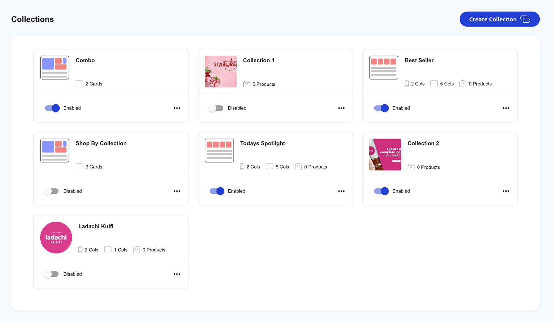
Opening the Shoopy collections page #
- In the left sidebar, click Catalog to expand it.
- Click Collections. The page opens with the header Collections and a Create Collection button at the top right.
- If you have not added a collection yet, you see the empty state: “Start Creating Collections for your Online Store”.
So, every action below starts from this Collections page.
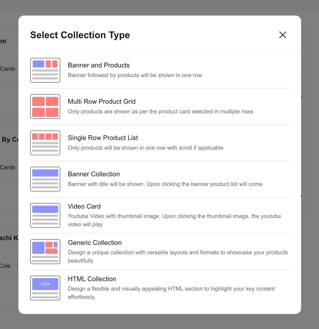
The eight Shoopy collection types #
When you click Create Collection, the Select Collection Type picker opens. Each tile shows the layout name and a short description. Pick the one that matches the section you want to build.
- Banner and Products — a banner image followed by a product row in the same section. So, use it when you want to lead with a hero visual and immediately offer the products underneath. Free plan.
- Multi Row Product Grid — only products, arranged in a grid across multiple rows. Therefore, this is the workhorse layout for category-driven product blocks. Free plan.
- Single Row Product List — only products, in one horizontally scrollable row. Also great for “Best sellers” or “New arrivals” strips. Free plan.
- Banner Collection — a standalone banner with a title. Clicking the banner opens the linked product list. So, use it for seasonal pushes or themed lookbooks. Free plan.
- Mini Banner Collection — a one-third-width banner. Therefore, three mini banners can sit side-by-side in a row. Useful for category teasers. Free plan.
- Video Card — a YouTube thumbnail that plays the video on click. Moreover, you can choose to autoplay. Basic plan and above.
- Generic Collection — a fully customisable section that mixes banner, video, and HTML cards in a single row, with column ratios you control. Free plan.
- HTML Collection — a free-form HTML block for landing-page-style content. Furthermore, render it inline (inherits theme styles) or in shadow DOM (isolated styles). Business plan and above.
If you are on a plan that does not include a type, the picker shows an upgrade prompt instead of opening the form.
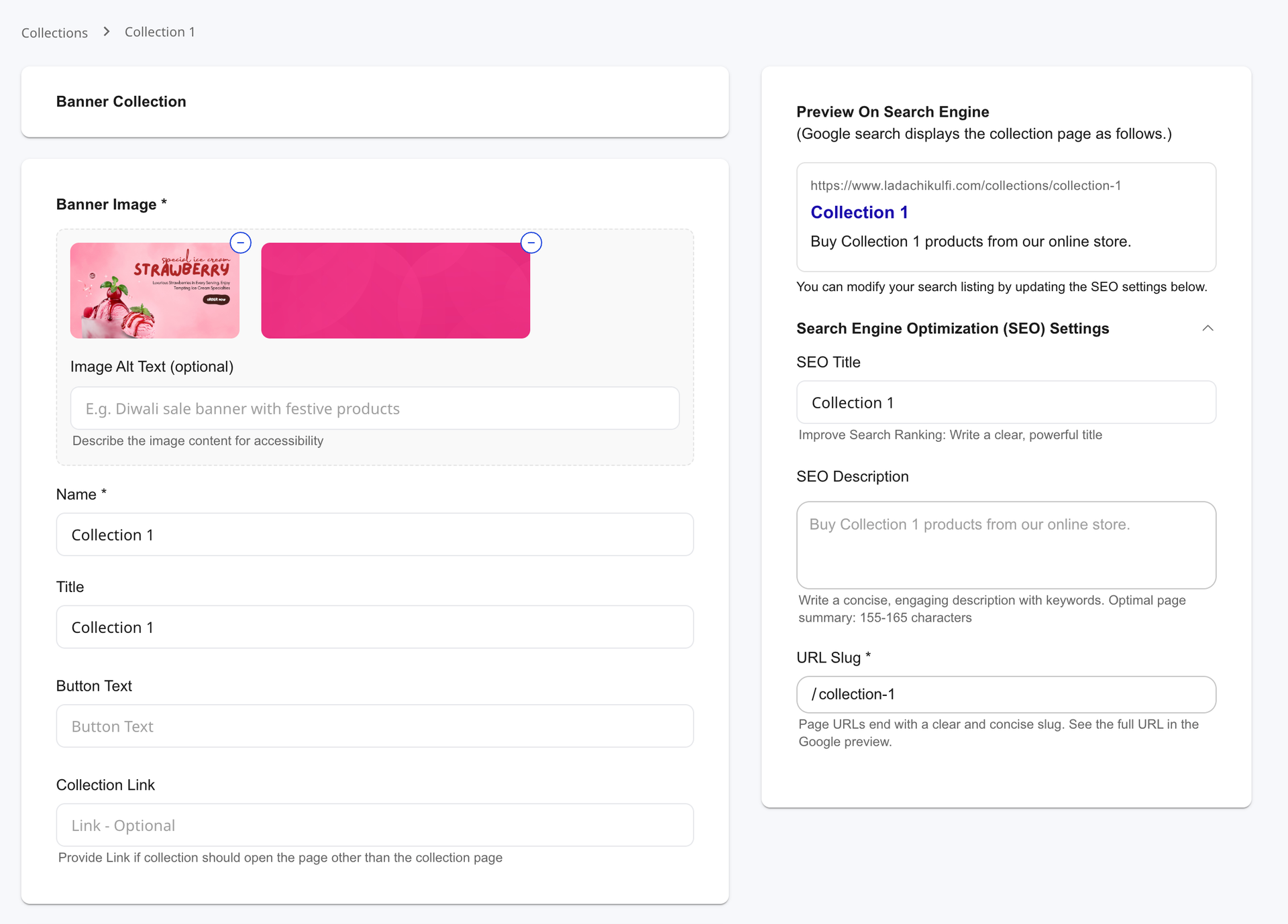
Creating your first Shoopy collection — Banner and Products #
This walkthrough uses the most common layout. The fields differ slightly per type — see the next section for variations.
- On the Collections page, click Create Collection.
- In the picker, click Banner and Products. The form opens.
- Enter the Name (required). For example,
Summer Sale 2026. Shoppers do not see this — it is your internal label. - Enter the Title. So, this is the headline shoppers see above the products. For example,
Summer Sale — up to 50% off. - Write a short Description. Therefore, shoppers get a one-line pitch under the title.
- Upload a Mobile Image (square, up to 1920 px on the long side) and a Desktop Image (16:9, up to 1920 px). Also, add Image Alt Text for accessibility — for example, “Diwali sale banner with festive products”.
- (Optional) Enter a Button Text — for example,
Shop Now— and a Collection Link if the button should open a custom page instead of the auto-generated collection page. - In Assign Products, choose From Categories to pull products dynamically from one or more Shoopy categories, or Specific Products to hand-pick.
- If you picked Specific Products, click the picker, search by name, select the products, and drag them in the assigned list to set the order shoppers see.
- Open the SEO section to review Slug, SEO Title, and SEO Description. The slug auto-generates from the title; override only if you have a strong reason.
- Click Save. As a result, the new Shoopy collection appears at the bottom of the Collections page with an Enabled toggle.
The storefront URL for SEO-enabled collections is /collections/{slug}. So, the live preview at the bottom of the SEO section shows the exact link shoppers will land on.
Field variations across Shoopy collection types #
The form adapts to the type you picked. Here is what changes:
- Multi Row Product Grid and Single Row Product List — no banner image fields. Therefore, you set the column count for desktop and mobile (1–6 cols), pick the products, and that is it.
- Banner Collection and Mini Banner Collection — banner image is required, products are optional. So, treat these as visual entry points rather than product blocks.
- Video Card — replace the desktop image with a Video URL (YouTube link, e.g.
https://youtu.be/abPWmLBZ3qc). Also, an Auto play checkbox controls autoplay on load. The thumbnail is taken from the desktop image you upload (recommended size 1280×720). - Generic Collection — instead of a single image, you build a row of cards (banner, video, or HTML). Furthermore, each card gets its own column ratio on a 1–12 grid, and you can set per-device padding and inter-card spacing.
- HTML Collection — the form replaces the standard fields with an HTML editor. Paste or write your HTML, then choose a Render Method: inline (inherits storefront theme) or shadow-dom (isolated styles, consistent across stores).
The SEO section appears only on Banner Collection, Banner and Products, Mini Banner, Multi Row Product Grid, and Single Row Product List. So, Video Card, Generic Collection, and HTML Collection do not get a public collection URL — they live as sections inside the page where you place them.
Picking products for a Shoopy collection #
You attach products in two ways using the Assign Products dropdown:
- From Categories — pick one or more categories. Therefore, the collection updates automatically as you add products to those categories. Best for evergreen sections like “All Apparel” or “Frozen Snacks”.
- Specific Products — open the product picker, search, and select. So, the collection shows exactly the SKUs you chose, in the order you arranged them.
In Specific Products mode, drag the assigned rows to reorder. Click the trash icon on any row to remove a product from the collection — the product itself stays in the catalog.
Reordering Shoopy collections on the storefront #
The order on the Collections page is the order shoppers see on your storefront home and category pages. To shuffle it:
- On the Collections page, open the three-dot menu on any collection card.
- Click Move Up to bump it one position higher, or Move at Top to send it to the very top.
- The new order saves immediately. Therefore, the storefront reflects it on the next page load.
So, lead with the most important Shoopy collection — typically the hero banner — and let the rest cascade by priority.
Hiding a Shoopy collection #
Each collection card has an Enabled / Disabled toggle. Toggle it off to hide the collection from the storefront without deleting it. Also, the products inside remain in the catalog — only the section disappears.
Therefore, use the toggle for time-bound campaigns (Diwali, Black Friday) and re-enable next year instead of recreating.
Editing or deleting a Shoopy collection #
- Edit — open the three-dot menu and click Edit. The form opens with all fields pre-populated. Save to apply.
- Delete — open the three-dot menu and click Delete. A confirmation dialog asks: “Are you sure you want to delete this collection ?”. Click Delete to remove the collection. The products stay in the catalog and in their categories — only the merchandised section is removed.
There are no delete restrictions on Shoopy collections. So, you can remove any collection at any time.
SEO for Shoopy collections #
Five collection types — Banner Collection, Banner and Products, Mini Banner, Multi Row Product Grid, Single Row Product List — get a public URL at /collections/{slug} and a full SEO block:
- Slug auto-fills from the title using the same lowercase-hyphen rules as categories. Therefore, override only if you have a strong keyword reason.
- SEO Title auto-fills from the title; rewrite for Google if the storefront title is too short.
- SEO Description auto-fills from the description; tighten to 155–165 characters for the SERP.
The live Google preview at the top of the SEO section updates as you type. So, use it to spot title or description overflow before saving.
For SEO on individual products, see Product SEO in Shoopy.
Tips for healthy Shoopy collections #
- Keep the home page short. Five to seven Shoopy collections above the fold is plenty. So, more sections dilute the message and slow the page.
- Lead with a banner. A hero banner sets the tone. Furthermore, a single strong visual outperforms three mediocre ones.
- Mix layouts. Alternate banner, grid, and list to keep the scroll interesting. Therefore, two grids back-to-back read as one long block.
- Use From Categories where you can. Auto-populated Shoopy collections never go stale. Specific Products is for curated picks like “Editor’s choice” or staff favourites.
- Audit quarterly. Hide or delete collections from past campaigns. As a result, the storefront stays current and the page weight stays light.
Troubleshooting Shoopy collections #
My collection does not show on the storefront #
Two common causes. First, the Enabled toggle may be off — turn it on. Second, the collection may be far down the order — open the three-dot menu and click Move at Top or Move Up.
The Video Card type is greyed out #
Video Card needs the Basic plan or above. So, upgrade your plan, or pick a Banner Collection instead and link it to a YouTube page.
The HTML Collection type is greyed out #
HTML Collection needs the Business plan or above. Therefore, upgrade your plan, or use a Generic Collection with an HTML card if your plan permits.
My banner image looks stretched on mobile #
You probably uploaded only the desktop image. So, edit the collection and upload the Mobile Image in 1:1 aspect ratio. Each collection serves the right image to the right device.
Products in my “From Categories” collection are not appearing #
Check the source category. First, the category may be hidden — see Creating and nesting Shoopy categories on visibility. Second, products may not be assigned to that category yet.
My HTML Collection styling clashes with the theme #
Switch the Render Method from inline to shadow-dom. As a result, the HTML renders inside an isolated boundary and the storefront styles do not bleed into it.
I cannot drag-reorder collections on the list page #
Drag is reserved for products inside a collection. So, on the Collections list page, use Move Up or Move at Top from the three-dot menu instead.
Related articles #
- Shoopy categories vs collections
- Creating and nesting Shoopy categories
- Adding a product in Shoopy
- Product SEO in Shoopy
- Glossary of Shoopy terms
Category: Products & Catalog · Author: Shoopy Team · Last reviewed: 2026-04-25